| Brand Hub
brand
guide
This guide contains everything you need to create and design content in UoG branding. It’s important the below guidance is followed, so we’re all creating authentic and consistent content.
logo
Our logo is our brand’s primary visual communication. It has a few rules which should be followed to ensure consistency across our creatives.
Only use in black/grey/white
Make sure that it meets accessibility guidance, eg do not use the white logo on a pale background.

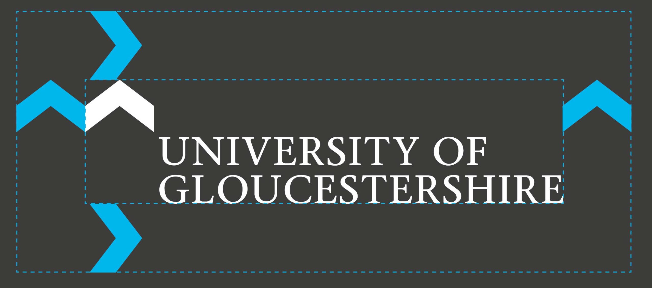
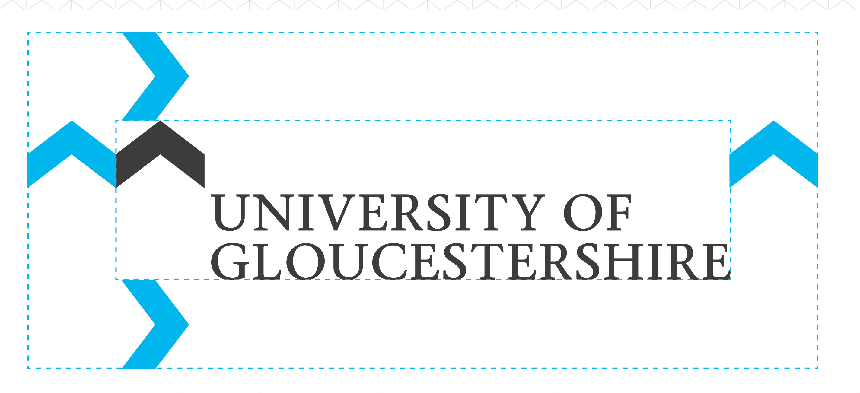
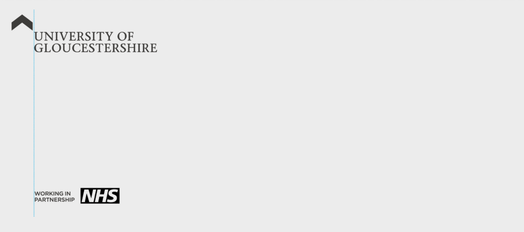
Exclusion zone
Ensure no other elements obscure the logo, use the chevron to create an exclusion zone.
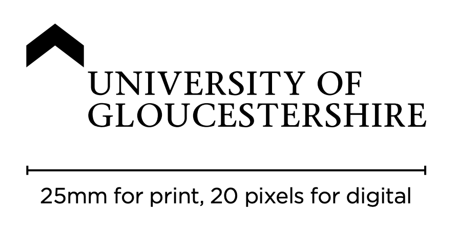
Minimum sizes
No less than 25mm wide in order to preserve the delicate serif edges on the logotype section.
Digital
20 pixels in width, again in order to ensure that the serifs on the logotype do not degrade too much.
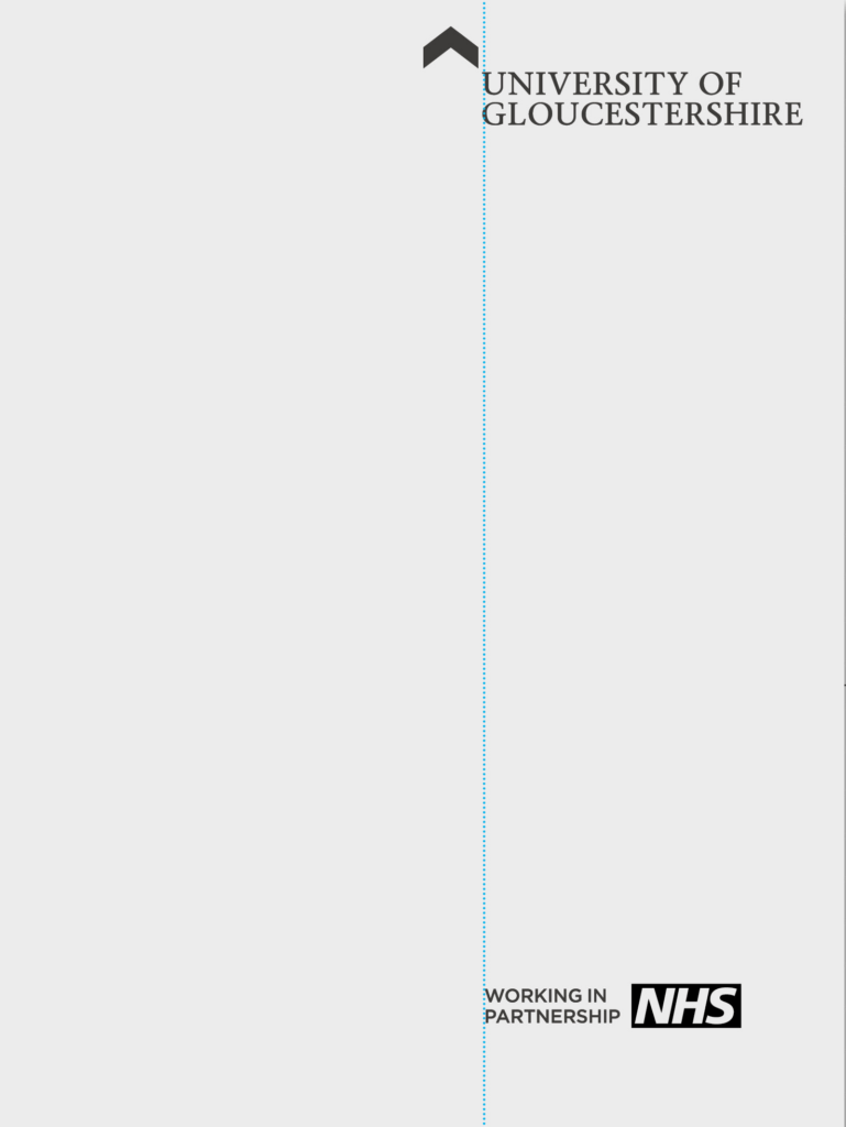
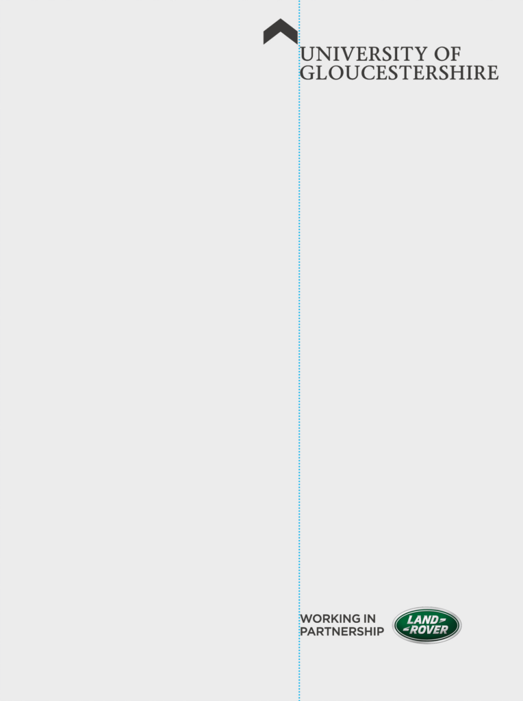
With partnerships
When using the logo with partnership logos/organisations, make sure the secondary logo doesn’t exceed the size of ours.
You also may want to add ‘in partnership with’ so it’s clear we’re the leading institution.

To note: Use of the University’s name and/or logo in a way which purports to suggest that the University has a legal connection with a third party is strictly prohibited. The University name and/or logo and/or identity must not be used or copied onto any document with a legal context, including contracts and agreements with third parties, except as may be necessary to describe the content of that document and in such cases, should be with the prior approval of the relevant person at University of Gloucestershire.
colours
Our colour palette is a reflection of our personality and helps bring creatives to life.
You should always use our branded colours when promoting the University.
TEAL
C77 M7 Y51 K0
R28 G166 B145
#1CA691
Pantone 3268
Black text
WCAG AA: Pass all text sizes
WCAG AAA: Pass large
WHITE TEXT
WCAG AA: Pass large
Blue
C78 M49 Y0 K0
R62 G119 B192
#3E77C0
Pantone 660
Black text
WCAG AA: Pass all text sizes
WCAG AAA: Pass large
WHITE TEXT
WCAG AA: Pass all text sizes
WCAG AAA: Pass large
Mustard
C0 M40 Y91 K0
R250 G167 B25
#FAA719
Pantone 1235
Black all text
WCAG AA: Pass all text sizes
WCAG AAA: Pass large
Red
C0 M86 Y50 K0
R255 G59 B88
#FF3B58
Pantone 1785
Black text
WCAG AA: Pass all text sizes
WCAG AAA: Pass large
WHITE TEXT
WCAG AA: Pass large
Pink
C0 M60 Y0 K0
R240 G136 B182
#F088B6
Pantone 204
Black all text
WCAG AA: Pass all text sizes
WCAG AAA: Pass all text sizes
White
C0 M0 Y50 KO
R255 G255 B255
#FFFFFF
Pantone N/A
Black all text
WCAG AA: Pass all text sizes
WCAG AAA: Pass all text sizes
Black
C0 M0 Y0 K0
R0 G0 B0
#000000
Pantone Black C
WHITE ALL TEXT
WCAG AA: Pass all text sizes
WCAG AAA: Pass all text sizes
Grey
C65 M57 Y55 K60
R53 G54 B55
#353637
Pantone 2336
White all text
WCAG AA: Pass all text sizes
WCAG AAA: Pass large
Colours guidance
- Try to use just one colour from the palette at a time, with black, white and grey used as supporting colours
- Black and white are the only colours you should use for body copy. You can see above which of those 2 colours passes accessibility with our brighter colours from the palette
- Grey can occasionally be used for body copy when you need to create a hierarchy of content
- The brighter colours from the palette can be used to make titles/CTAs stand out – providing they meet the WCAG accessibility outlined above.
typography colours
For all copy including headers, web addresses and room signage, use only black and/or white. Grey can also be used when creating a hierarchy of content.
Other colours from the palette can be used for special treatments in campaigns and core recruitment projects. Please consult the Creative Team for guidance and creatives.
Black
White
typeface
We have a few fonts used across content at UoG. It’s important to always use branded fonts so our creatives are recognisably us.
Do not use more than 2 fonts together:
- 1 for titles and CTAs
- 1 for body copy.
Printed text should be minimum 8pt.
Digital text should be minimum 12pt.
For accessibility reasons, it’s important to always stick to this guidance.
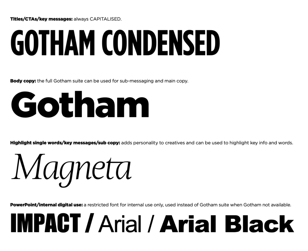
Titles/CTAs/key messages: always CAPITALISED.
- GOTHAM CONDENSED
Body copy: the full Gotham suite can be used for sub-messaging and main copy.
- Gotham
Highlight single words/key messages/sub-copy: adds personality to creatives and can be used to highlight key info and words.
- Magneta
Powerpoint/internal digital use: a restricted font for internal use only, used instead of Gotham suite when Gotham not available.
- IMPACT/Arial/Arial Black
graphics
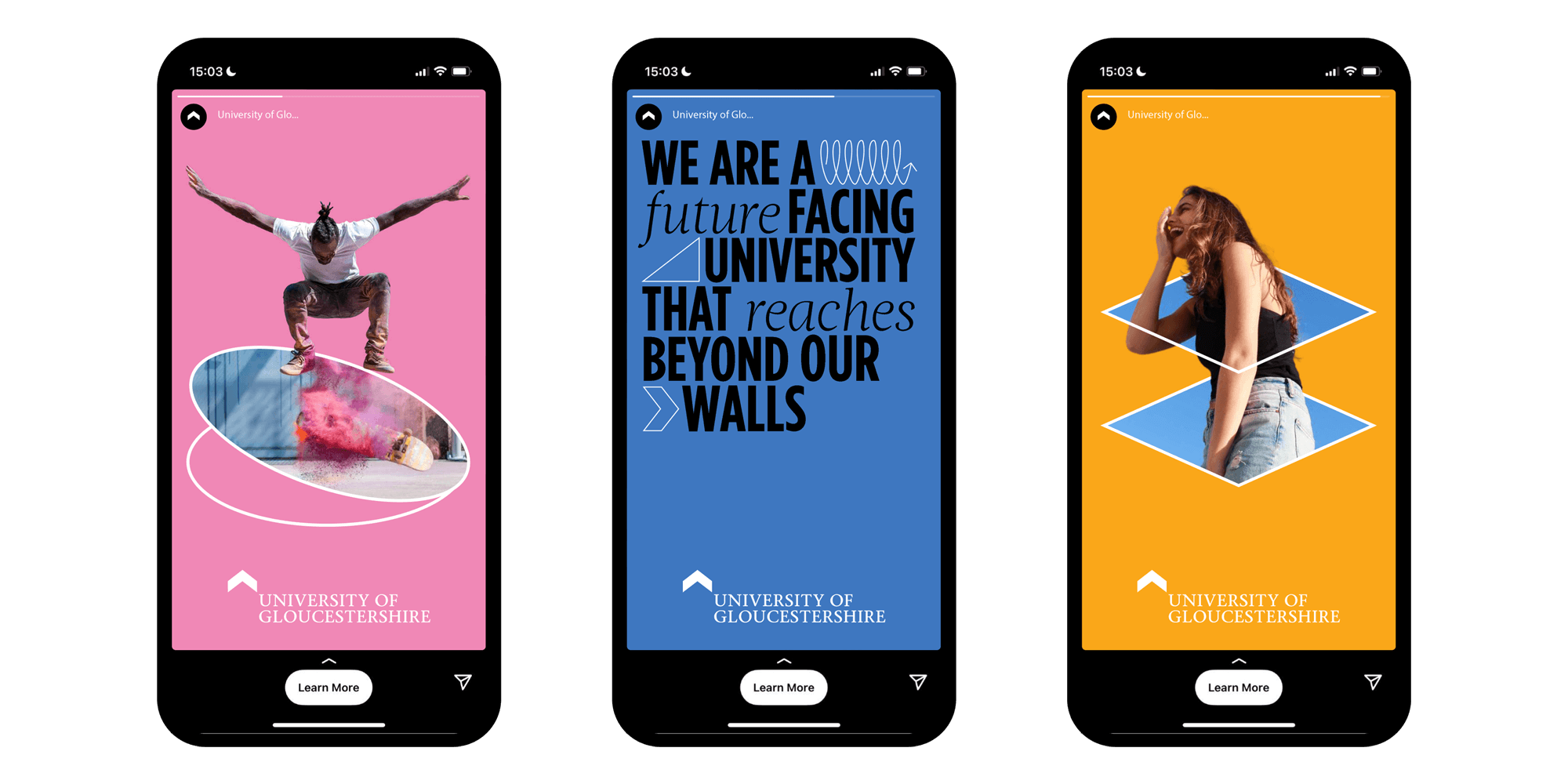
Our suite of branded graphics can be used in creatives to highlight key messaging and create visually engaging content.
Graphics can be wrapped around a subject in a full bleed image, used in title copy to break up content and with cut-out imagery.
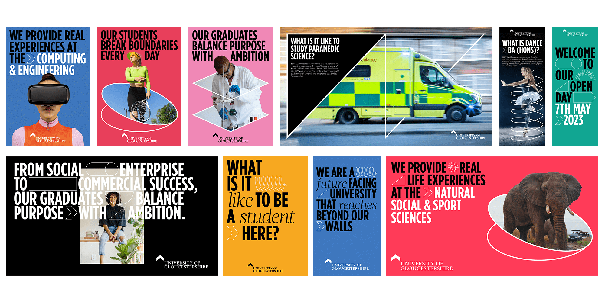
Assets should be used by the University’s Creative Team and approved freelance designers only. A suite of branded templates is available via Marq.
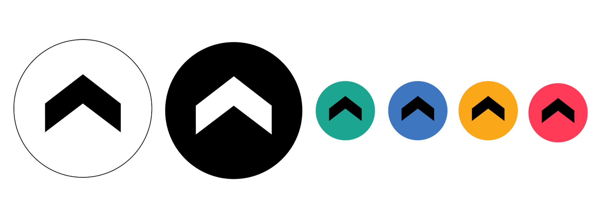
social icons
These can be used across our social media platforms. They can be used in black, white and grey. Plus, there are a variety of colour options for reels, stories and posts.